Ask Questions to Make Data-Driven Decisions
Step 1: Define the Problem
There are Six main different types of problems that we can look into for the project. However, the problem type that would fit best would be to Categorize things. In essence we are categorizing how members think about their benefits.
Categorizing Things
An example of a problem requiring analysts to categorize things is a organization’s goal to improve customer satisfaction. Analysts might classify customer service calls based on certain keywords or scores. This could help identify top-performing customer service representatives or help correlate certain actions taken with higher customer satisfaction scores.
With the organization I worked with we need to get a feel for how the members feel about the benefits they get with their time here. We’ll be looking at satisfaction levels so categorizing things will be the best bet for our problem to solve. There might be another problem we could try to solve, but in this case we’ll be sticking with the Categorizing Things problem and solution.
Step 2 Ask SMART Questions:
We will consider what kind of questions to ask the members of the organization. Our survey can’t be too long, so we’ll aim for about 20 to 25 questions. We need to make sure that our questions follow the SMART outline that is given in our notes for the Google Data Analytics course. SMART Questions include questions that are:
Specific– Does our question address the problem in step 1? Does the question have context?
Measurable– The question needs to have a measurable answer so that we can compare our results, this is not limited to quantitative data, however, quantitative data is more easily measurable than qualitative data and I personally prefer quantitative data to qualitative data for this reason.
Action-Oriented– Our questions should inspire action, if our questions don’t inspire action but are supplementary and cover topics that we would not need to solve then they wouldn’t be very helpful to us.
Relevant– The question needs to be about the particular problem we need to solve.
Time-Bound– Are our questions relevant to the specific time being studied? It does us not good to answer a question that is out of the scope of the time frame we want. What good would it do us to solve a problem that isn’t currently an issue?

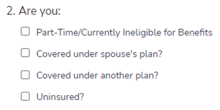
This is a very specific question; it gets at whether the person is currently using the organization’s healthcare plan
This question is also very relevant to the survey that we’re taking, it is asking whether the members use the plan by the organization, if the members isn’t using our plan, then their responses will be less important than those who currently use our plan. They shouldn’t be completely town out but because people using our plan are affected more, they should have more weight put on their responses.

This question could be more specific by asking what other kinds of “another plan” there are. It could be considered closed ended because it doesn’t get to what those other types of plans are. It should have a free response option to offer a more open-ended option.

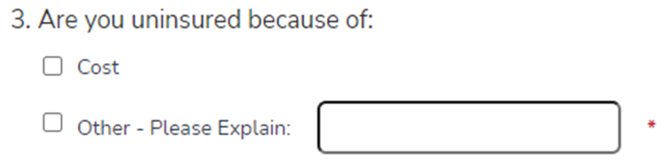
This question is open ended because it allows for people to explain why they would be uninsured if not for the cost, this is a good way to paste the question and could give us answers that we did not anticipate in our survey.

This question Is qualitative, however there is scale to this question so it can possibly be converted into a quantitative answer. For this to be more measurable I would assign values to the answers on a scale between 1 and 5 with 1 being the least and 5 being the most. I tried to do this within the question itself on the survey but the members above me told me that they wanted qualitative answers.

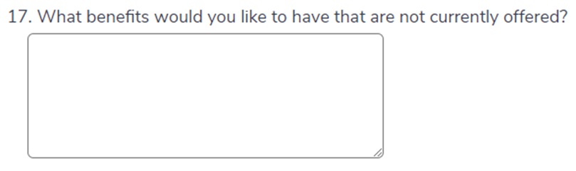
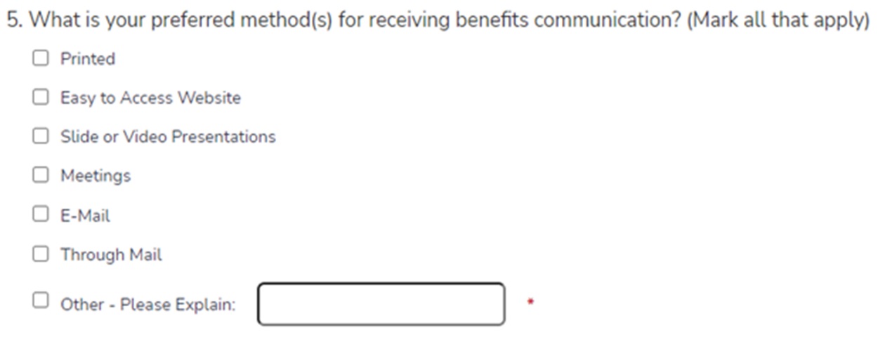
This question has good context and allows for multiple selections, perhaps we should do a ranking system for which is most preferred, but that is not necessary for our purposes. It even allows for a free response which is a good way to answer and is open ended (which could give us a lot of options we didn’t foresee).

This is a very measurable question, which is good for our purposes. However, if it was up to me, I would make 5 be “the most understood well” and 1 “The least understood” because having more of something (like a higher number) implies that you have more of an understanding (it scales much better than 1 being the most and 5 being the least). One example where 1 would be the most and the highest number would be the least would a ranking system. We’re not ranking multiple options here so we should use an option that is more scalable.

I would make this question more measurable (or quantitative) by putting 1 tough 5 complimentary to the answers that are there. However, this may be easier for the members to understand than assigning a number to it and would be less confusing for those taking the survey.

The objective of this question would be an important aspect of it. Considering whether we want the members to pay more in the long run or pay more every time the visit the hospital. This doesn’t need to be open ended (or include a short answer) because we want a very specific answer (one or the other).
This question needs to be very specific so I would not make it open ended. We need to know for sure whether our members want to medical plans to pick from. There should be no ambiguity here and having it be close ended is preferred. The only open-endedness this question should have is the reason behind picking no (as a free response).

I like how open ended this question is. However, I would have made this question be required and there be a “None” selectable option available as well in addition to the free response too if possible.

I like how open ended this question is with the free response at the end. However, it is tempting to quantify these results, but for our purposes the members may not be able to quantify their results so using qualitative answers may be the most accurate way they can respond.
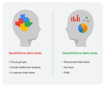
We need to consider whether we want to ask qualitative questions or quantitative questions for our survey. In our SMART Questions we had both qualitative and quantitative questions. We took survey’s that were fairly scalar (Strongly Understand to Not Understand at All) so we can convert these later to numerical values if we want to look at things such as relatedness. We also asked for qualitive questions such as number 17 where the user just answers with a free response. A good survey usually includes both and we seem to be able to use both from our survey answers.

We need to consider whether we’re using Big Data or Small Data with our analysis. For our purposes we’ll be using small data.
Small data includes data that:
- Describes specific metrics over a short, well-defined period (collected over the course to about two weeks),
- Usually organized and analyzed in spreadsheets (using Excel or Google Sheets to organize and analyze) and it is not necessary to use programs such as RStudio (with R Code)
- Used by a small to mid-sized the organization (total number of the populations is around 100)
- Is a manageable size for analysis
Step 3: Create a Scope of Work for the Project
Data Analyst: Patrick Burcham
Purpose: The survey will be conducted to determine what the satisfaction of the members are about their benefits. We’ll determine what benefits need to be added and subtracted based on their responses.
Scope/Major Project Activities:
| Activity | Description |
| Survey the Members at the Organization | In this activity I will help create a survey that will be distributed to the members at the organization, this will gauge their satisfaction with current and future benefit plans |
| Presentation | I will give a presentation based on the findings after working with ‘S’ to help with determining the best course of action for the upper management at the organization, this will include a lot of visuals so there will be no need for a dashboard (the data doesn’t update periodically) |
This project does not include:
Specify the things that this project isn’t responsible for doing (out of scope). For instance, “this project does not involve a summation of 2019 data analysis”
- Does not include recipients that the organization interacts with daily
- Does not include past recipients that are no longer using the organization
- Does not focus heavily on members with the organization that do not get benefits
Schedule Overview / Major Milestones:
The expected schedule for the project. This can be defined by milestones (e.g. “all data is cleaned and processed”), periods of time (“Week 1 / Week 2”), or other ways based on the needs of the project.
| Milestone | Expected Completion Date | Description/Details |
| Completed Collection of the Survey | 09/23/21 | The survey should be completely collected by this point |
| Completed Presentation | 10/22/21 | The presentation should be completed by this point, I’m not sure I’ll give one, but I’ll be ready to if the opportunity presents itself |
Estimated Date for Completion:
October 22nd, 2021
Step 4: Working with Stake holders
This is the email(s) that I received for creating the survey that the organization would be using.
[Start Interaction here]
the organization
Winston-Salem
Direct: [Censored]
Main: [Censored]
Fax: [Censored]
Email: [Censored]
Website:
View Help Line’s Directory of Services for Recipients in ******* County:
Too many local Recipients are alone, hungry and struggling to meet basic needs. Your gift will change their lives.
Confidentiality Notice
This message is intended exclusively for the individual or entity to which it is addressed. This communication may contain information that is proprietary, privileged or confidential. If you are not the named addressee, you are not authorized to read, print, retain, copy or disseminate this message or any part of it. If you have received this message in error, please notify the sender immediately either by phone (***)***-**** or reply to this email and delete all copies of this message.
From: Patrick Burcham
Sent: Thursday, September 2, 2021 10:31 AM
To: “B”
Cc: “J”
Subject: Re: Member Benefits Survey
- Q2 skip logic, appears if Q1 is no
Q2 now has display logic
- Q3 skip logic, appears if Q2 is uninsured
Q3 now has display logic
- Q4 skip logic, appears if Q3 is other OR you could make it so the answer choice on Q3 is other, with a write in option.
Q4 has display logic now
- Q5 don’t need the numbers or colons “:” beside the answer choices
Colons are gone from question 5 now
- Q6 add (mark all that apply)
Added
- Q10/Q11 – maybe this should be a rank too, instead of asking them to pick only 3. Is there a different way to do ranking questions beyond the drag and drop? Those results sometimes show up funny.
Now Question 11 is a ranking question
- For questions 11 – 16/12-17 isn’t there an option in Survey Gizmo (like the radio button grid, perhaps) that work well for condensing/combining these questions?
Question 12 is now 12–17. I did not delete those questions just in case it was not what you were looking for. I think I tried that before but ‘B’ said the ranking single question with a single answer might be better for the spreadsheets that our survey will take up later.
- Question 18/19 – we don’t need the numbers beside the answer choice options
Done
- For questions 19-32/21-34 same note as above about the numbers beside the answer choices and also combining/condensing these into one question…I’d suggest using a radio button grid or some other option that combines all these things…
Question 20 is now 21–34. I did not delete those questions just in case it was not what you were looking for. I think I tried that before but ‘B’ said the ranking single question with a single answer might be better for the spreadsheets that our survey will take up later.
- Need to add question asking people to rank what is most important to them as we select a plan:
- Out of pocket costs/deductibles
- Premium/cost out of each pay check
- Prescription formulary
- Provider network (keeping same doctor)
- Other (write in option)
Added as question 35
[End Interaction here]
Prepare Data for Exploration:
Step 5: Consider the Population Sample Size and Collection
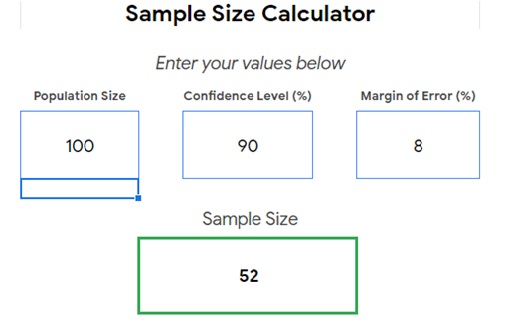
The population size of the organization is close to 100 people. We’ll calculate the sample size that we need to get the confidence interval that we are pursuing. For our example we’ll only need a 90% confidence interval. Although the accuracy needs to be at least 90% we’re not using something that needs as much confidence as something like a drug test at a pharmacy (which needs to be at 99%). We have more leeway for inaccuracy with our survey. Our Margin of Error is 8% (once again we’re not running pharmacy tests, so our accuracy doesn’t need to be the strictest).
I plugged the information for our sample size into a Sample Size Calculator that I have in my Google Drive. This can be calculated manually, but there is no need for us to calculate it manually.

When we plug these numbers into our online survey calculator, we get 52 people for what we need to randomly survey to get the accuracy that we need.
How the Data will be collected:
The data will be collected as a first party data from the members themselves within the organization directly. The survey will be conducted tough Survey Alchemer and even though we are using a third-party tool to collect the data it still will be considered Primary data (or First party Data) because The organization is the one conducting the survey.
Primary vs. Secondary Data:
| Data Format Classification | Definition | Examples |
| Primary data | Collected by a researcher from first-hand sources | – Data from an interview you conducted – Data from a survey returned from 20 participants – Data from questionnaires you got back from a group of members |
| Secondary data | Gathered by other people or from other research | – Data you bought from a local data analytics firm’s customer profiles – Demographic data collected by a university – Census data gathered by the federal government |
The data will be Primary Data because the organization will be the ones collecting it. There will not be second party or third-party sources that the data collection will go tough. This means we will have more control and accuracy over the results than if we were using a second party or third-party source.
Internal vs. External Data:
| Data Format Classification | Definition | Examples |
| Internal data | Data that lives inside a organization’s own systems | – Wages of members across different business units tracked – Sales data by store location – Product inventory levels across distribution centers |
| External data | Data that lives outside of a organization or the organization | – National average wages for the various positions throughout your the organization – Credit reports for customers of an auto dealership |
This data will be Internal or contained within the organization itself. It will be stored within Survey Alchemer, but the organization has essentially total control over the data.
Discrete vs. Continuous Data:
| Data Format Classification | Definition | Examples |
| Continuous data | Data that is measured and can have almost any numeric value | – Height of kids in third grade classes (52.5 inches, 65.7 inches) – Runtime markers in a video – Temperature |
| Discrete data | Data that is counted and has a limited number of values | – Number of people who visit a hospital on a daily basis (10, 20, 200) – Room’s maximum capacity allowed – Tickets sold in the current month |
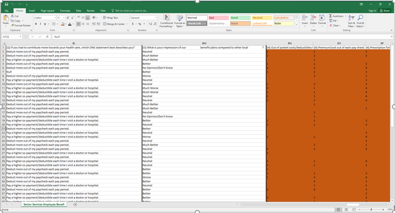
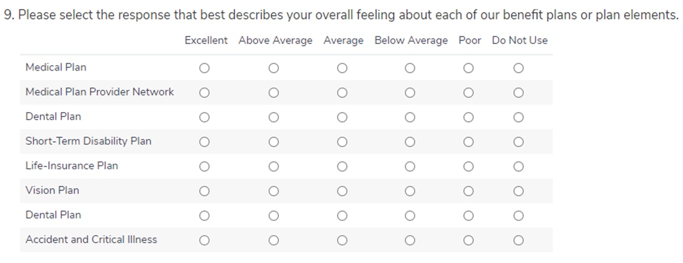
This data is discrete and not continuous. The data is very qualitative and that plays a part in looking at the Discrete option. For example, look at Question 9
The answers are split up into different “Buckets” (Excellent, Above Average, Average, Below Average, Do Not Like). These buckets are different levels from each other and are separate and are not continuous (or is limited).
Qualitative vs. Quantitative:
| Data Format Classification | Definition | Examples |
| Qualitative | Subjective and explanatory measures of qualities and characteristics | – Exercise activity most enjoyed – Favorite brands of most loyal customers – Fashion preferences of young adults |
| Quantitative | Specific and objective measures of numerical facts | – Percentage of board certified doctors who are women – Population of elephants in Africa – Distance from Earth to Mars |
Most of these answers are qualitative, not quantitative. I had requested that the questions be more quantitative.
With question 9 I had requested that we use numbers to mark the answers (1-5), instead of qualitative (Excellent, Above Average, Average, Below Average, Poor, Do Not Use). However, the stake holder decided to go with qualitative data.
Nominal vs. Ordinal:
| Data Format Classification | Definition | Examples |
| Nominal | A type of qualitative data that isn’t categorized with a set order | – First time customer, returning customer, regular customer – New job applicant, existing applicant, internal applicant – New listing, reduced price listing, foreclosure |
| Ordinal | A type of qualitative data with a set order or scale | – Movie ratings (number of stars: 1 star, 2 stars, 3 stars) – Ranked-choice voting selections (1st, 2nd, 3rd) – Income level (low income, middle income, high income) |
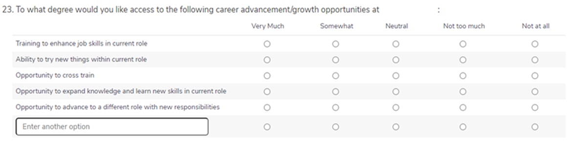
This data is Ordinal in questions that have qualitative answers like 9 and 23. It is on a scale instead of being just unordered qualitative data.
That is why I wanted to use quantitative data (because it was ordered) for a more exact measurement. However, the stake holder felt that this could potentially confuse the members taking the survey.
Structured vs. Unstructured:
| Data Format Classification | Definition | Examples |
| Structured data | Data organized in a certain format, like rows and columns | – Expense reports – Tax returns – Store inventory |
| Unstructured data | Data that isn’t organized in any easily identifiable manner | – Social media posts – Emails – Videos |
The data is structured. If it was unstructured, it would be in a format like emails, social media posts or videos. The data should be stored in tables that are accessible to users later. I do have one example of data that is somewhat unstructured (Question 3) but structured data is far more common in my capstone.
Step 6: Create Models for the Database
Data Modeling:

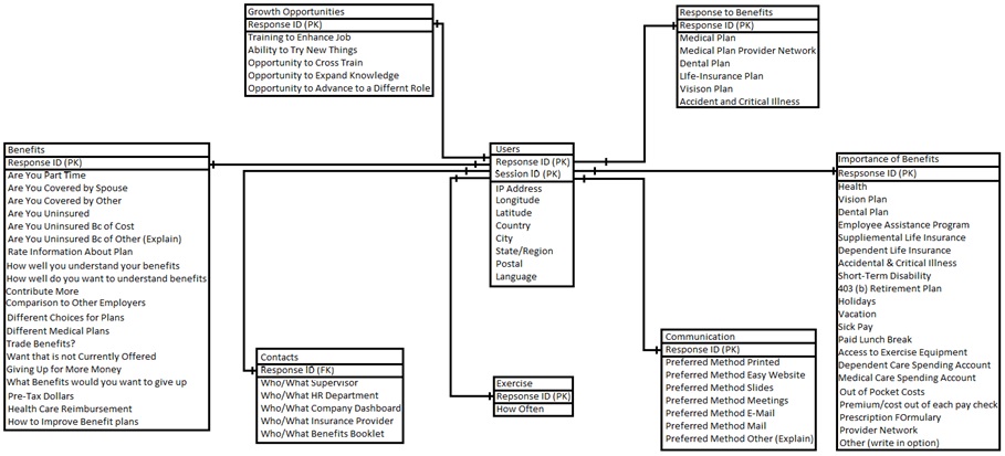
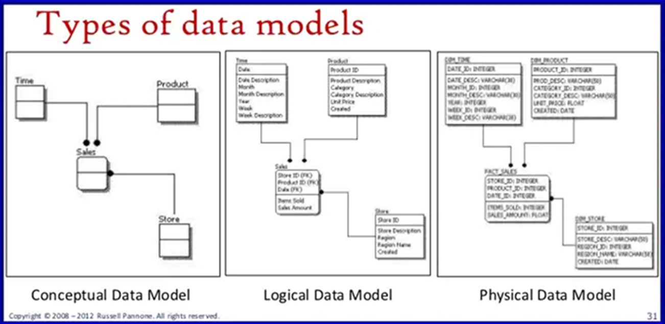
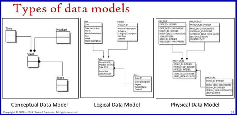
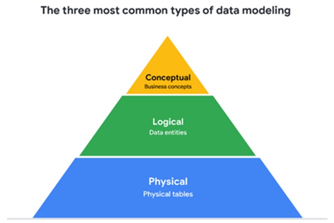
When building a model for our data we need to go in tee major steps. First is the conceptual model (which is the least detailed). Next we need to build the Logical Model (which is more detailed than the conceptual model, but less detailed than the physical model). Lastly we build a physical model for our data base program. This will contain some of the actual options that we will need to select when importing out data into the database.

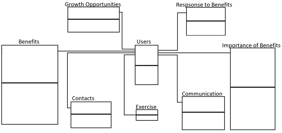
The Data Modeling for this Capstone will not be needed. The data is normalized in first normal form, so the entire dataset is in a single excel or google sheet. However, we’ll create a Conceptual and Logical Data Diagram just for the sake of doing so. We won’t need a Physical Data Model for our example since we won’t be using a Database program, but you can guess that we’d add things like Varchar and Int to such code.
Conceptual Model

Logical Data Model

Process Data from Dirty to Clean
Step 7: Cleaning Up Excel Data
These steps are completed after we have collected the data and constructed our Conceptual, Logical and Physical Models. On 09/23/21 the survey had closed and we got 70 responses. We met our goal of 52 responses for our sample size so we’ll be able to continue on with our project.
We’ll need to export this data to Excel so that we can clean it up. We could use Google Sheets, but using Excel is a personal preference that I have. In order to do that we’ll have to go to the Results Tab and then select Export. Then we’ll select CSV/Excel to download the file. We’ll exclude “Include Email Invitation and Contact Fields” so that the user’s data can remain anonymous.
It’s important to make sure that the data aligns with our business objective. Our Business Objective is to understand the levels of satisfaction that members have with their current benefits plan and what they want with for the potential future for their benefits. We won’t be able to substitute data that we are missing with this dataset because it is specific to our members. We can’t use another organization’s members to determine how ours fill about benefits offered by our organization.
When there’s no data:
The first thing to look at when cleaning up the data Is blank spaces within the Excel document that holds the data. One thing to consider is whether this data is Null or a purposely “No” (which in this case it was left blank even though it should be a “No”). There is a difference between “No” and Null. Null is unanswered, a lack of data or an unknown. A “No” is an actual answer, which could be a zero.
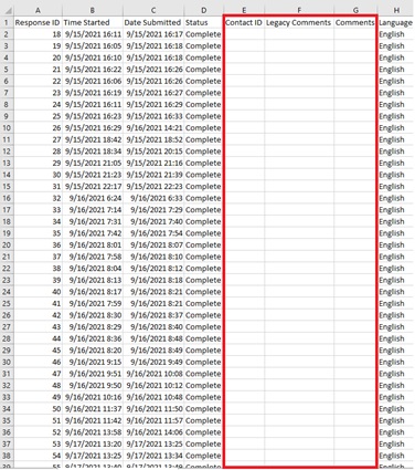
In our first example the columns Contact ID, Legacy Comments and Comments are all unanswered. In this case we will delete the Contact ID column (since we’re publishing this data and thus want to keep the users anonymous). For the Legacy Comments and Comments column we will enter the word “None”. This is the same a zero, but not the same as null. If the answer is null, then there is potential for a future answer. If the answer is “None” that means we will not have a different future answer that has another value.

After we’ve deleted columns that we do not need we’ll fill in the rest of the data that is needed. Some of the data will need to be left blank because of the structure of the question (Mark All that Apply). This is necessary for the visualization software to be able to work well with our table.
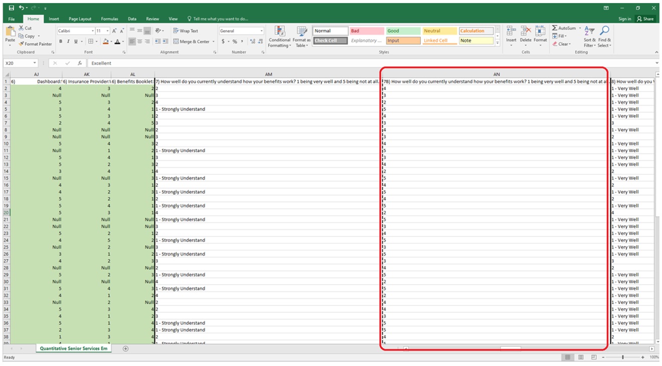
I spent about 2 to 3 hours cleaning up all the blank and Null values. This will make looking at each question much easier when dealing with the data. I also numbered each question with a number and a letter. This will help keep straight the data. Since the data is in first normal form there is the possibility that there will be multiple columns will be multiple answers the same question. If we had made the database that we had made models for in Step 6 this would be less of a problem.

I went back and scanned the data again after fixing the blanks and Nulls. I checked spelling, formatting and other issues like that. I fixed all the issues I could find, and I finished cleaning the data. The data is clean and formatted (within Excel) as of 09/23/21 16:28:00 EST.
One thing that would have made the cleaning go much quicker is using filters to find blank spaces in questions where those would have to be filled in as blank or Null. I manually searched for all the spaces, which took more time (In the future, I’ll remember to use the filter option in Excel). I did use ‘Control-H’ to ‘Replace All’ for empty spaces, however, that stopped working about halfway tough the cleaning process and I had to manually drag copies of the word “Null” around to fill in the rest of the spaces.
Perhaps there’s a way to automate this process. I doubt using SQL would have helped with cleaning this data, also it wasn’t a very large dataset (only 70 entries large) so working on it manually wasn’t as time consuming as one might have thought.
I needed to reformat the data (Create copy columns) and relabel them to give numbers to the qualitative answers that they have. They’re scaled qualitative answers, so this is possible. This way I can do some correlation comparisons when looking at different variables and seeing how they are related to each other with scatter plots.

Analyze Data to Answer Questions
Step 8: Organize the Data
This is a list of the Columns for the Dataset (a lot of the names were so long that it was too difficult to fit them all within a good viewing angle on the sheet, this will make it easier to work with the Pivot tables). Columns listed in green are copied columns that were converted to quantitative values.
Data Range:
‘Raw Data’!$A$1:$CN$71
Columns
Response ID
Time Started
Date Submitted
Status
Language
Referer
SessionID
User Agent
IP Address
Longitude
Latitude
Country
City
State/Region
Postal
1A) Are you currently enrolled in our organization’s members health care plan?
2A) Are you: Part-Time/Currently Ineligible for Benefits
2B) Are you: Covered under spouse’s plan?
2C) Are you: Covered under another plan?
2D) Are you: Uninsured?
3A) Cost: Are you uninsured because of:
3B) Other – Please Explain::Are you uninsured because of:
3C) Other – Please Explain::Are you uninsured because of:
4A) How would you rate the information you receive from the organization about your benefit plans?
4B) How would you rate the information you receive from the organization about your benefit plans?
5A) What is your preferred method(s) for receiving benefits communication? (Mark all that apply) Printed
5B) What is your preferred method(s) for receiving benefits communication? (Mark all that apply) Easy to Access Website
5C) What is your preferred method(s) for receiving benefits communication? (Mark all that apply) Slide or Video Presentations
5D) What is your preferred method(s) for receiving benefits communication? (Mark all that apply) Member Meetings
5E) What is your preferred method(s) for receiving benefits communication? (Mark all that apply) E-Mail
5F) What is your preferred method(s) for receiving benefits communication? (Mark all that apply) Tough Mail
5G) What is your preferred method(s) for receiving benefits communication? (Mark all that apply) Other – Please Explain (Selected)
5H) What is your preferred method(s) for receiving benefits communication? (Mark all that apply) Other – Please Explain (Explained)
6A) Supervisor: When you want detailed information about how your benefits work, where would you turn. Please rank your answers from first choice to last choice, from top to bottom.
6B) Department: When you want detailed information about how your benefits work, where would you turn. Please rank your answers from first choice to last choice, from top to bottom.
6C) Organization Dashboard: When you want detailed information about how your benefits work, where would you turn. Please rank your answers from first choice to last choice, from top to bottom.
6D) Insurance Provider: When you want detailed information about how your benefits work, where would you turn. Please rank your answers from first choice to last choice, from top to bottom.
6E) Benefits Booklet: When you want detailed information about how your benefits work, where would you turn. Please rank your answers from first choice to last choice, from top to bottom.
7A) How well do you currently understand how your benefits work? 1 being very well and 5 being not at all.
7B) How well do you currently understand how your benefits work? 1 being very well and 5 being not at all.
8A) How well do you WANT to understand how your benefits work? 1 being very well and 5 being not at all.
8B) How well do you WANT to understand how your benefits work? 5 being very well and 1 being not at all.
9A) Medical Plan: Please select the response that best describes your overall feeling about each of our benefit plans or plan elements.
9B) Medical Plan Provider Network: Please select the response that best describes your overall feeling about each of our benefit plans or plan elements.
9C) Dental Plan: Please select the response that best describes your overall feeling about each of our benefit plans or plan elements.
9D) Short-Term Disability Plan: Please select the response that best describes your overall feeling about each of our benefit plans or plan elements.
9E) Life-Insurance Plan: Please select the response that best describes your overall feeling about each of our benefit plans or plan elements.
9F) Vision Plan: Please select the response that best describes your overall feeling about each of our benefit plans or plan elements.
9G) Accident and Critical Illness: Please select the response that best describes your overall feeling about each of our benefit plans or plan elements.
10A) Health (Medical Plan): Rate these benefits in terms of importance. Please select the bubble that best corresponds to the degree of importance you place on the following benefits.
10B) Vision Plan: Rate these benefits in terms of importance. Please select the bubble that best corresponds to the degree of importance you place on the following benefits.
10C) Dental Plan: Rate these benefits in terms of importance. Please select the bubble that best corresponds to the degree of importance you place on the following benefits.
10D) Member Assistance Program: Rate these benefits in terms of importance. Please select the bubble that best corresponds to the degree of importance you place on the following benefits.
10E) Supplemental Life Insurance: Rate these benefits in terms of importance. Please select the bubble that best corresponds to the degree of importance you place on the following benefits.
10F) Dependent Life Insurance: Rate these benefits in terms of importance. Please select the bubble that best corresponds to the degree of importance you place on the following benefits
10G) Accidental & Critical Illness: Rate these benefits in terms of importance. Please select the bubble that best corresponds to the degree of importance you place on the following benefits.
10H) Short-Term Disability: Rate these benefits in terms of importance. Please select the bubble that best corresponds to the degree of importance you place on the following benefits.
10I) 403(b) Retirement Plan and Organization Match: Rate these benefits in terms of importance. Please select the bubble that best corresponds to the degree of importance you place on the following benefits.
10J) Holidays: Rate these benefits in terms of importance. Please select the bubble that best corresponds to the degree of importance you place on the following benefits.
10K) Vacation: Rate these benefits in terms of importance. Please select the bubble that best corresponds to the degree of importance you place on the following benefits.
10L) Sick Pay: Rate these benefits in terms of importance. Please select the bubble that best corresponds to the degree of importance you place on the following benefits.
10M) Paid Lunch Break: Rate these benefits in terms of importance. Please select the bubble that best corresponds to the degree of importance you place on the following benefits.
10N) Access to Exercise Equipment On-Site (*********):Rate these benefits in terms of importance. Please select the bubble that best corresponds to the degree of importance you place on the following benefits.
10O) Dependent Care Spending Account: Rate these benefits in terms of importance. Please select the bubble that best corresponds to the degree of importance you place on the following benefits.
10P) Medical Care Spending Account (Flexible Spending Account): Rate these benefits in terms of importance. Please select the bubble that best corresponds to the degree of importance you place on the following benefits.
11A) In a typical year, how often have you used the exercise equipment at the ********* location?
12A) If you had to contribute more towards your health care, which ONE statement best describes you?
13A) What is your impression of our organization’s benefit plans compared to other local organizations?
13B) What is your impression of our organization’s benefit plans compared to other local organizations?
14A) Out of pocket costs/deductibles: What is most important to you as we select a plan? Please let 1 indicate which is most important to you and 5 indicate which is least important to you.
14B) Premium/cost out of each paycheck: What is most important to you as we select a plan? Please let 1 indicate which is most important to you and 5 indicate which is least important to you.
14C) Prescription formulary: What is most important to you as we select a plan? Please let 1 indicate which is most important to you and 5 indicate which is least important to you.
14D) Provider Network (Keeping the same doctor): What is most important to you as we select a plan? Please let 1 indicate which is most important to you and 5 indicate which is least important to you.
14E) Other (write in option): What is most important to you as we select a plan? Please let 1 indicate which is most important to you and 5 indicate which is least important to you.
15A) Would you like to have two different medical plans to choose from? One may cost more and provide higher benefits, while another may cost less and provide lesser benefits (a Core Plan and a Buy-Up Plan)?
16A) Would you like the opportunity to trade some of your current benefits for others of more importance to you?
17A) What benefits would you like to have that are not currently offered?
18A) Would you consider trading (or giving up) some of your benefits in order to receive more money in your paycheck each pay period?
19A) What benefits would you be willing to give up in exchange for money in your paycheck? See questions 19-32 for a list of benefits.
20A) The IRS allows members to establish an members-owned health savings account (HSA) that secures pre-tax dollars from your earnings in a fund for future medical needs. HSAs are established with high deductible health plans that come with much lower premiums than traditional plans. If you had the option of participating in a high deductible health plan in conjunction with owning an HSA, would you choose to do so?
21A) The IRS allows organizations to establish a Health Care Reimbursement Account to help members pay for certain health care costs with pre-tax income that they must otherwise pay for with after-tax income (for example, deductibles and non-covered medical expenses). If you could allocate a portion of your income to that account, would you choose to do so?
22A) Please provide additional comments on how our organization can improve upon its members benefit plans, or better meet your members benefit plan needs.
23A) Training to enhance job skills in current role: To what degree would you like access to the following career advancement/growth opportunities at the organization:
23B) Ability to try new things within current role: To what degree would you like access to the following career advancement/growth opportunities at the organization:
23C) Opportunity to cross train: To what degree would you like access to the following career advancement/growth opportunities at the organization:
23D) Opportunity to expand knowledge and learn new skills in current role: To what degree would you like access to the following career advancement/growth opportunities at the organization:
23E) Opportunity to advance to a different role with new responsibilities: To what degree would you like access to the following career advancement/growth opportunities at the organization:
23F) Assistance with continuing education: To what degree would you like access to the following career advancement/growth opportunities at the organization:
23G) For our pay to reflect the job we do and the number of years we have been here.: To what degree would you like access to the following career advancement/growth opportunities at the organization:
23H) Hoping other members desire to enhance skills & knowledge: To what degree would you like access to the following career advancement/growth opportunities at the organization:
23I) Open to any learning opportunities and ability to contribute to growth of our agency and services provided for older adults: To what degree would you like access to the following career advancement/growth opportunities at the organization:
23J) some crossing training cannot be done due to regulations. I cannot do a social members job or a nursing job.: To what degree would you like access to the following career advancement/growth opportunities at the organization:
Once the data has been organized (and relabeled with Numbers and Letters) we will Sort the Data in Pivot Tables in Excel. We’ll play around with different numbers to get charts that show information based on what is going on. Because we are dealing with only 71 entries there isn’t really a need for much SQL on this project. We can filter and sort fairly well in Excel. Also we’d need to rename all the columns in the table to do this in order to be able to use the name of those columns in SQL. They’re too long for us to type out as they stand now. There was no need to connect multiple tables together so there isn’t really a need for joining tables using the data in SQL as well.
We’ll need to rename the columns to be shorter names (and to eliminate spaces) in SQL by loading it into Big Query. We’ll sort and filter a little bit using Big Query as an example.
Converting Columns to Type Integer:
Converting the _8B_Want_Understand Column to an Integer Value (You will need to change the query settings in the “More” tab option to overwrite the current table, you’ll have to reset this every time you cast when you change just the query settings). Converting columns to type integer is necessary if we want to make calculations. If they column remains type Varchar we won’t be able to do calculations on them.
SELECT *, SAFE_CAST(_8B_Want_Understand AS INT) AS _8B_Want_Understand_Int
FROM `project1-322422.*****_*******.Survey`
(Another Example of this)
SELECT *, SAFE_CAST(_7B_Currently_Understand AS INT) AS _7B_Currently_Understand_Int
FROM `project1-322422.*****_*******.Survey`
Figuring Out Which Columns are Categories and Which are Subcategories:
This is our table of “Categories” and “Subcategories”. The Categories are measurements that can be measured independently of subcategories (this means it can be split up based on time (time is not supposed to be a part of your subcategories). and you can use aggregate functions in a meaningful way such as average, median, mode or sometimes sum, max and minimum, without another column. You only need themselves to get results based on some aggregation.
The Subcategories are the measurements that cannot be measured independently of categories or other sub categories. They always have to be paired with a category or another subcategory. Categories can be independent of subcategories or they can be paired with other Categories or Subcategories (but it is not necessary to pair them to get a chart/measurement from them or use an aggregate function with them). Things such as map coordinates, geographical locations or id columns are usually subcategories. IDs cannot be added or subtracted (using aggregate functions such as average on them is meaningless). You can use count or count distinct, but not much more than that. This is also true for latitude and longitude values.
| Categories | Subcategories |
| 1) Current Enrollment | Location |
| 2) Covered Under Other Plan | Week Answered (1 or 2) |
| 4) Rating Information Received | Cities |
| 5) Receiving Benefits Communication | State |
| 6) Ranking Benefits | On/Off Site |
| 7) Understanding Benefits | Geographical Region |
| 8) Desire to Learn | Postal Zip Code |
| 9) Feelings About Benefits | |
| 10) Rate Benefits by Importance | |
| 11) How Often do you use Exercise Equipment | |
| 12) Contribute More Towards Healthcare | |
| 13) Impression of Plan Compared to Other’s | |
| 14) Rank Out of Pocket Costs | |
| 15) Two Medical Plans to Pick From | |
| 16) Trade Benefits | |
| 17) What Benefits Do You Want | |
| 18) Consider Giving Benefits for More Money | |
| 19) What Benefits Would you Give Up for More Money | |
| 20) IRS HSA Accounts | |
| 22) Addition Comments | |
| 23) Access to Growth Opportunities at the organization |
This is our chart based on the questions that we have about the data. Dark blue text are Subcategories. Red text are questions we need to ask in the future. These measurements are how we’ll be able to get our data into a form for answering these questions.
| Top 12 Question: | Measurements | ||
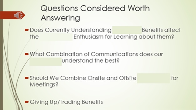
| 1) What is the best combination of preferred communication to members? | 5) Receiving Benefits Communication | 4) Rating Information Received | |
| 2) Are On-Site members more likely to be good participants in meetings? | 7) Understanding Benefits | 8) Desire to Learn | On/Off Site |
| 3) What benefits should we consider giving up/trading for our members? | 17) What Benefits Do You Want | 19) What Benefits Would you Give Up for More Money | |
| 4) How do our plans compare to other’s based upon geographical areas? | 13) Impression of Plan Compared to Other’s | Geographical Region | |
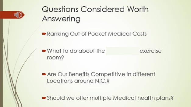
| 5) What is the least and most important ranking of out of pocket costs with our members? | 14) Rank Out of Pocket Costs | ||
| 6) Should we consider turning the exercise room into something else? | 11) How Often do you use Exercise Equipment | ||
| 7) Would you use a treadmill desk in place of an exercise room? | Null | ||
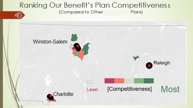
| 8) In what cities/zip codes is our benefits perceived as competitive with other organizations? | 13) Impression of Plan Compared to Other’s | Cities | Postal Zip Code |
| 9) Are our members’ that are serious about healthcare taking exercise seriously? | 11) How Often do you use Exercise Equipment | 12) Contribute More Towards Healthcare | |
| 10) Should we offer two medical plans? | 15) Two Medical Plans to Pick From | ||
|
11) Is there a Correlation between How Well Member’s Understand Benefits and How Well the Organization has Explained Benefits to Them |
4) Rating Information Received | 7) Understanding Benefits | |
| 12) Is there a Correlation Between How Well Member’s Currently Understand Benefits and How much they want to | 7) Understanding Benefits | 8) Desire to Learn |
Answering Our Top Questions:
Question 1) What is the best combination of preferred communication to members?
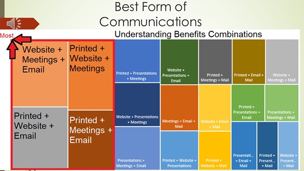
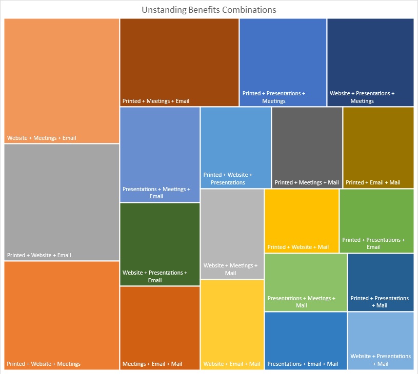
We first need to figure out which combinations are the most understood that people would use from the organization. I split up the 6 total possible into combinations of 3.
| Category | Totals |
| Printed + Website + Presentations | 6 |
| Printed + Website + Meetings | 13 |
| Printed + Website + Email | 14 |
| Printed + Website + Mail | 5 |
| Printed + Presentations + Meetings | 8 |
| Printed + Presentations + Email | 5 |
| Printed + Presentations + Mail | 4 |
| Printed + Meetings + Email | 11 |
| Printed + Meetings + Mail | 6 |
| Printed + Email + Mail | 6 |
| Website + Presentations + Meetings | 8 |
| Website + Presentations + Email | 7 |
| Website + Presentations + Mail | 4 |
| Website + Meetings + Email | 15 |
| Website + Meetings + Mail | 6 |
| Website + Email + Mail | 6 |
| Presentations + Meetings + Email | 8 |
| Presentations + Meetings + Mail | 5 |
| Presentations + Email + Mail | 5 |
| Meetings + Email + Mail | 7 |

I got this chart from looking at the different combinations and how well they are understood. This chart is based off the Categories and Total Data. However, it is easier to understand because it uses surface area to determine how effective the combination is. The further to the left and top the box is and the more area it takes up, the more effective it is for the members.
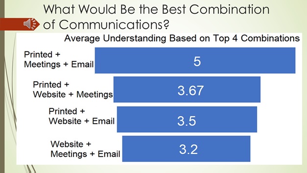
Based on this chart the 4 most effective combinations of conveying information are (in order from most effective to least effective)
Website + Meetings + Email, Printed + Website + Email, Printed + Website + Meetings or
Printed + Meetings + Email
We’ll filter for these 4 combinations of communications in our SQL code in Big Query:
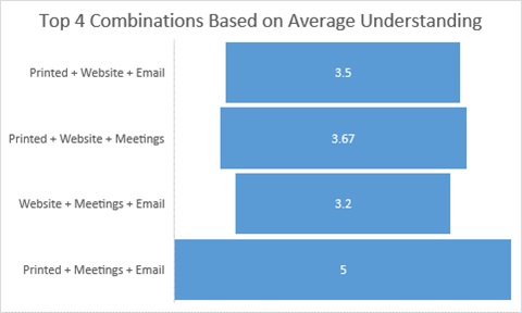
SELECT _5A_Printed, _5B_Website, _5D_Meetings, _5E_Email, AVG(_4B_Rate_Information_Int) AS Average_Understanding
FROM `project1-322422.*****_*******.Survey`
GROUP BY _5A_Printed, _5B_Website, _5D_Meetings, _5E_Email;

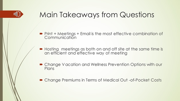
According to the data, Printed, Meetings and Emails have the highest understanding of all the top 4 combinations to investigate. Having a printed and email copy of the benefits gives the user a digital and physical ledger for their records while meetings give them interactivity they would not normally get on a website with other people)
The solution where members understand the most includes meetings. Not all of our members meet on campus so we’ll have to determine if the enthusiasm for members’ and their understanding of their benefits is better for those who meet on site for members meetings.
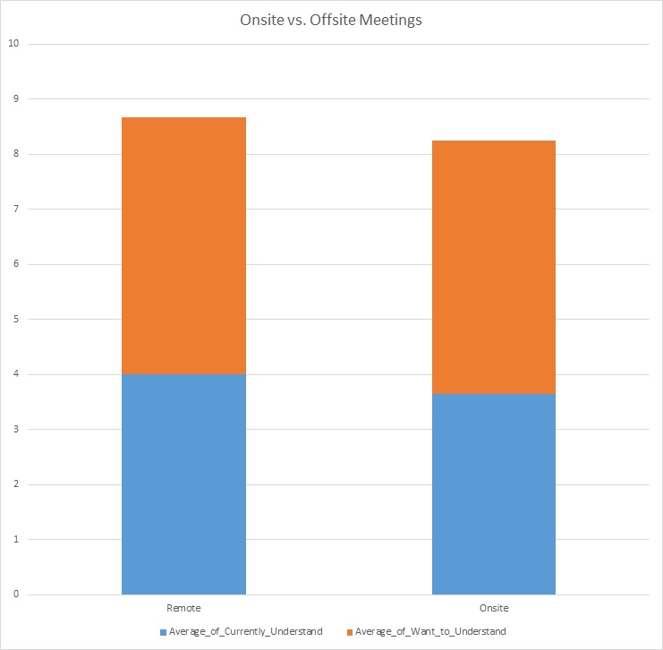
2) Are On-Site members more likely to be good participants in meetings?
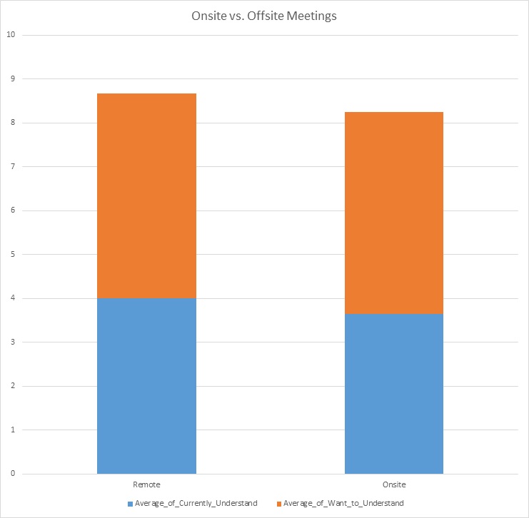
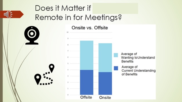
We’ll put this SQL code into Big Query and get the table that we need to make the following chart:
SELECT AVG(_7B_Currently_Understand_Int) AS Average_of_Currently_Understand, AVG(_8B_Want_Understand_Int) AS Average_of_Want_to_Understand, Work_Location
FROM `project1-322422.*****_*******.Survey`
WHERE Work_Location IS NOT NULL
GROUP BY Work_Location;

Calculating the Percentage Difference between the two columns:
= 4.90229% difference
Solution:
Calculate percentage difference
between V1 = 8.666666667 and V2 = 8.251966122
|V1−V2|[(V1+V2)2]×100=?|V1−V2|[(V1+V2)2]×100=?
=|8.666666667−8.251966122|[(8.666666667+8.251966122)2]×100=|8.666666667−8.251966122|[(8.666666667+8.251966122)2]×100
=|0.414700545|[16.9186327892]×100=|0.414700545|[16.9186327892]×100
=0.4147005458.4593163945×100=0.4147005458.4593163945×100
=0.0490229×100=0.0490229×100
=4.90229%difference
There is only a 5% difference between both column’s total. This shows that having offsite members’ at the meetings would be a good idea and it will not have a major effect on how effective the meetings are.
3) What benefits should we consider giving up/getting for our members?
All the benefits that are a part of question 10 (Please select the bubble that best corresponds to the degree of importance you place on the following benefits.) was filtered in SQL Code on Big Query.
SELECT _17A_What_Benefits
FROM `project1-322422.*****_*******.Survey`
WHERE _17A_What_Benefits LIKE ‘%health%’ OR _17A_What_Benefits LIKE ‘%vision%’
OR _17A_What_Benefits LIKE ‘%dental%’ OR _17A_What_Benefits LIKE ‘%members assistance%’
OR _17A_What_Benefits LIKE ‘%life insurance%’ OR _17A_What_Benefits LIKE ‘%illness%’
OR _17A_What_Benefits LIKE ‘%disability%’ OR _17A_What_Benefits LIKE ‘%holiday%’
OR _17A_What_Benefits LIKE ‘%vacation%’ OR _17A_What_Benefits LIKE ‘%sick%’
OR _17A_What_Benefits LIKE ‘%lunch%’ OR _17A_What_Benefits LIKE ‘%exercise%’
OR _17A_What_Benefits LIKE ‘%medical care spending account%’;
This was the result of the previous SQL query in Big Query.
| Row | _17A_What_Benefits |
| 1 | Fitness reimbursement plan: get rewarded for staying healthy. Treadmill desk/standup desk. Mental health days for living at home dept. Travel benefits, or 4 day work week. |
| 2 | More Vacation days. Instead of years of service certificate, how about, every year we stay increased in vacation time. There is value in long term members. Paid day off for our birthday etc. My husbands job , they keep giving them more and more vacation has a retention program. I am stuck at the same amount. His organization keeps adding days. |
| 3 | combine sick and vacation |
| 4 | Is there such a thing as rewards/ incentives for being healthy and not utilizing medical and Rx benefits? 🙂 My PCP doctor (who I only see for sick visits) unbeknownst to me, dropped me as a patient because I had not been in in a couple years. Scheduler said I was too healthy. I had to get reestablished as a patient with this provider. I thankfully (knock on wood) and historically now for several years, I only see one medical provider (not my PCP) that can do all my wellness and preventative services in one visit annually. Also, the pre-loaded cards we received for certain purchases was VERY nice to have. |
This is the SQL Code put into Big Query to determine which people wanted to give up benefits:
SELECT _19A_Give_Up
FROM `project1-322422.*****_*******.Survey`
WHERE _19A_Give_Up LIKE ‘%health%’ OR _19A_Give_Up LIKE ‘%vision%’
OR _19A_Give_Up LIKE ‘%dental%’ OR _19A_Give_Up LIKE ‘%members assistance%’
OR _19A_Give_Up LIKE ‘%life insurance%’ OR _19A_Give_Up LIKE ‘%holiday%’
OR _19A_Give_Up LIKE ‘%vacation%’ OR _19A_Give_Up LIKE ‘%sick%’
OR _19A_Give_Up LIKE ‘%lunch%’ OR _19A_Give_Up LIKE ‘%exercise%’
OR _19A_Give_Up LIKE ‘%medical care spending account%’;
Only one person wanted to give up benefits that were a part of the number 10 in the questionnaire.
| Row | _19A_Give_Up |
| 1 | Everything but dental and health |
4) How do our plans compare to other’s based upon geographical areas?
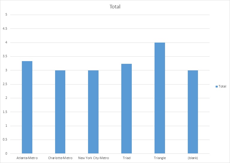
Our benefits are about average when compared to the benefits of other organizations in different areas based upon the geographical region they’re in. A lot of our benefits are perceived to be within .5 of being average compared to others.

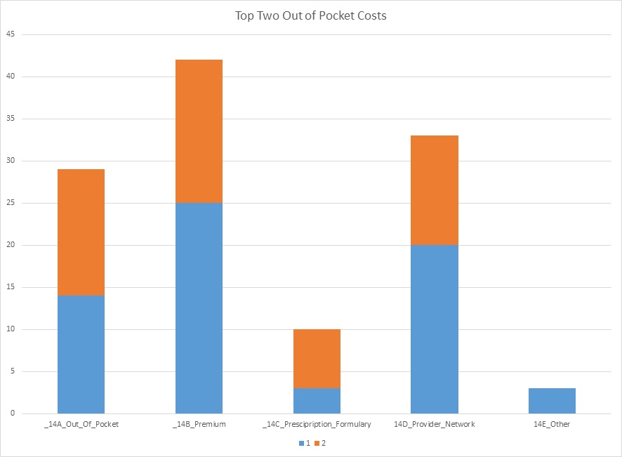
5) What is the least and most important ranking of out-of-pocket costs with our members?
This is the SQL Code that was put into Big Query to give us the results for this question:
SELECT COUNT(_14A_Out_Of_Pocket)
FROM `project1-322422.*****_*******.Question_14`
WHERE _14A_Out_Of_Pocket = 1;
SELECT COUNT(_14A_Out_Of_Pocket)
FROM `project1-322422.*****_*******.Question_14`
WHERE _14A_Out_Of_Pocket = 2;
SELECT COUNT(_14B_Premium)
FROM `project1-322422.*****_*******.Question_14`
WHERE _14B_Premium = 1;
SELECT COUNT(_14B_Premium)
FROM `project1-322422.*****_*******.Question_14`
WHERE _14B_Premium = 2;
SELECT COUNT(_14C_Prescription_Formulary)
FROM `project1-322422.*****_*******.Question_14`
WHERE _14C_Prescription_Formulary = 1;
SELECT COUNT(_14C_Prescription_Formulary)
FROM `project1-322422.*****_*******.Question_14`
WHERE _14C_Prescription_Formulary = 2;
SELECT COUNT(_14D_Provider_Network)
FROM `project1-322422.*****_*******.Question_14`
WHERE _14D_Provider_Network = 1;
SELECT COUNT(_14D_Provider_Network)
FROM `project1-322422.*****_*******.Question_14`
WHERE _14D_Provider_Network = 2;
SELECT COUNT(_14E_Other)
FROM `project1-322422.*****_*******.Question_14`
WHERE _14E_Other = 1;
SELECT COUNT(_14E_Other)
FROM `project1-322422.*****_*******.Question_14`
WHERE _14E_Other = 2;
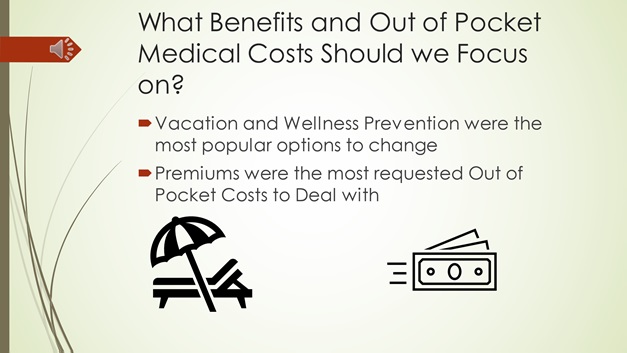
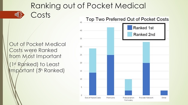
Based on the data that we’ve collected the most effective course of action would be to use Premium/Cost out of each paycheck. That had the most ranked as number 1 and it had the most overall number 1 and 2 ranks total together out of all the options.

6) Should we consider turning the exercise room into something else?
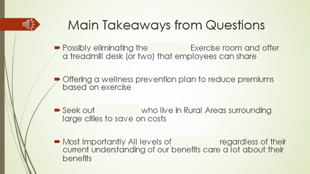
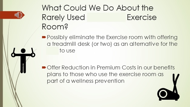
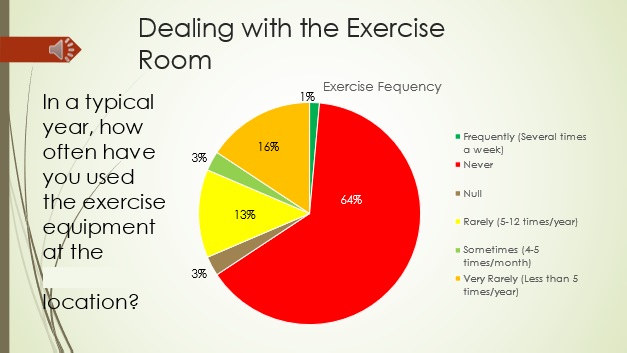
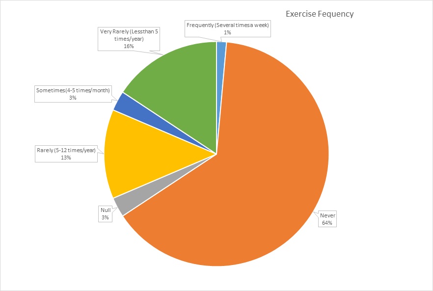
Because 64% of the members never use the exercise equipment all year, perhaps we should get the small percentage that does a treadmill desk and convert the exercise room into something else or offer a Wellness Prevention Program to incentivize exercising.

7) I suggested that we offer treadmill desks to people who wanted one.
This would free up the exercise room and only a few would have to be purchased. If this is to be followed up and taken seriously by upper management a follow up survey would be a great idea. Some questions to include would be:
Which would you prefer more: a treadmill desk or an exercise bike that you could slide underneath your sitting desk?
Question Logic- If person answered exercise bike then-
Rank 1 to 10 (1 being the least, 10 being the most) how likely would you average using an exercise bike for at least tee hours a week?
Question Logic- If person answered treadmill desk then-
Rank 1 to 10 (1 being the least, 10 being the most) how likely would you average using a treadmill desk for at least tee hours a week?
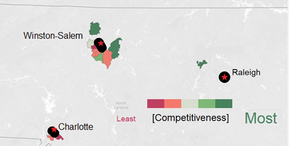
8) In what cities/zip codes is our benefits perceived as competitive with other organizations?
Based on the data (with in-state locations) our benefits ire perceived as not very competitive with zip codes near downtown areas of large cities while outside the heart of the city it is viewed more favorably.

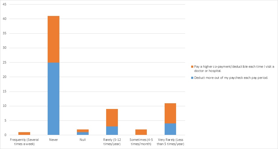
9) Are our members’ that are serious about healthcare taking exercise seriously?
Based on the data, people who never exercised on the exercise equipment wanted to deduct more out of each paycheck for each pay period while people who exercised more than never more often wanted to pay a higher co-payment/deductible each time they visited the hospital. This shows that exercise led to people wanting to pay more out of pocket costs and if exercise was encouraged it could potentially save the organization more money.

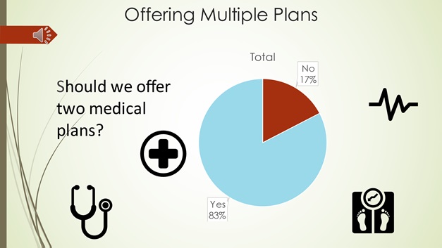
10) Should we offer two medical plans?
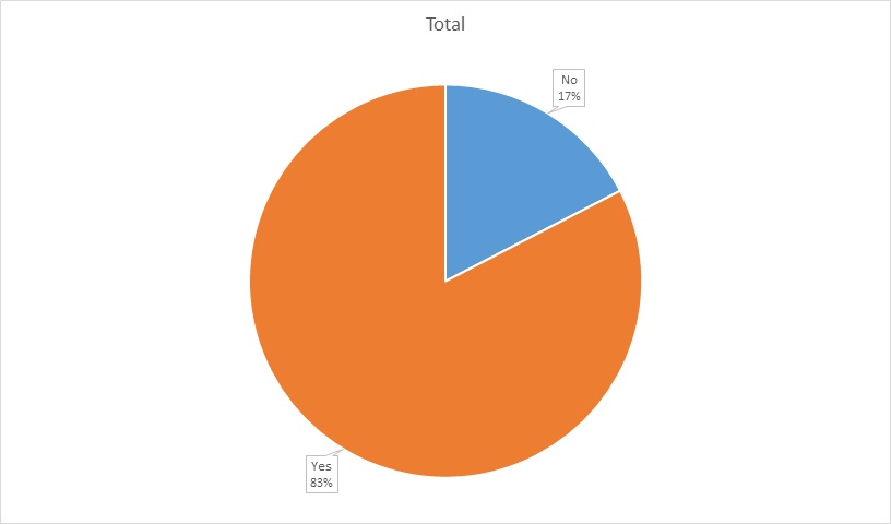
Based on the data we should offer two medical plans. A large majority of people wanted to have more than one plan. Cost will be a big deciding factor for what plans we should offer the organization, however, there is a potential for the organization to save money here based on the members’ choice.

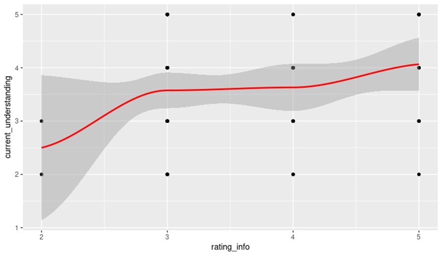
11) Is there a Correlation between How Well Member’s Understand Benefits and How Well the Organization has Explained Benefits to Them?
We’ll need to use R Programming for this question. We’ll type in some code and get a correlation between the two variables. One of these variables being column 4B (How would you rate the information you receive from the organization about your benefit plans?) and the other variable being column 7B (How well do you currently understand how your benefits work? 1 being very well and 5 being not at all). We’ll also get a scatter plot and best fit line to see our data and understand it more easily.
[Start Code in R]
# Installing packages
install.packages(“tidyverse”)
install.packages(reader)
install.packages(readx1)
install.packages(“ggplot2”)
# installing libraries
library(tidyverse)
library(readr)
library(readxl)
library(ggplot2)
# Import data from excel sheet in from the 4B and 7B Column
rating_info <- read_excel(“Current Responses.xlsx”, sheet = 1, range = ‘AB1:AB71’)
current_understanding <- read_excel(“Current Responses.xlsx”, sheet = 1, range = ‘AQ1:AQ71’)
# combine both lists into a dataframe, delete the 48th row, and view the new combined list
combined_info <- data.frame(rating_info, current_understanding)
#Eliminate rows containing Null
combined_info <- combined_info[-c(48), ]
#Check the Data Frame
View(combined_info)
#change this to numeric
rating_info <- as.numeric(unlist(rating_info))
#change this to numeric
current_understanding <- as.numeric(unlist(current_understanding))
View(rating_info)
View(current_understanding)
# get the corrleation between the currently_understanding and rating_information
cor.test(rating_info, current_understanding)
# plotting the graph and best fit line
ggplot(data = combined_info, aes(x = rating_info y = current_understand))) +
geom_point(data = combined_info, mapping = aes(x = rating_info, y = current_understand)) +
geom_smooth(data = combined_info, mapping = aes(x = rating_info, y = current_understand), color = ‘red’)
[End Code]
When we run > cor.test(rating_info, current_understanding) in our console we get:
Pearson’s product-moment correlation
data: rating_info and current_understanding
t = 2.0378, df = 67, p-value = 0.04552
alternative hypothesis: true correlation is not equal to 0
95 percent confidence interval:
0.005196667 0.452394209
sample estimates:
cor
0.2415802
Our correlation between those two variables (the correlation is under “cor” on the chart) is .2415802. The closer this number to 1 the higher the correlation. That is a very low correlation between those two variables. We have a 95% confidence interval meaning we are 95% sure that the correlation is .2415802. Here’s what the chart looks like.

You can see that the spread is evenly spread among different points in our chart. The line is more horizontal than vertical and that is a clue as to how correlated these variables are. Based on this chart and the Cor value I would say that the correlation between people rating the information they have received from the organization and How Well they understand their benefits is very weak.
12) Is there a Correlation Between How Well Member’s Currently Understand Benefits and How much they want to Understand Them?
We want to understand the relationship between how much members currently understand their benefits and how much they want to understand their benefits. We’ll use R programming to figure out the correlation between the variables of columns 7B (How well do you currently understand how your benefits work?) and 8B (How well do you WANT to understand how your benefits work?).
[Start Example Code]
# Installing packages
install.packages(“tidyverse”)
install.packages(reader)
install.packages(readx1)
install.packages(“ggplot2”)
# installing libraries
library(tidyverse)
library(readr)
library(readxl)
library(ggplot2)
# Import data from excel sheet in from the 4B and 7B Column
current_understand <- read_excel(“Current Responses.xlsx”, sheet = 1, range = ‘AQ1:AQ71’)
want_understand <- read_excel(“Current Responses.xlsx”, sheet = 1, range = ‘AS1:AS71’)
# combine both lists into a dataframe, delete the 48th row, and view the new combined list
combined_info <- data.frame(current_understand, want_understand)
#Eliminate rows containing Null
combined_info <- combined_info[-c(47, 48), ]
#Check the Data Frame
View(combined_info)
#change this to numeric
current_understand <- as.numeric(unlist(current_understand))
#change this to numeric
want_understand <- as.numeric(unlist(want_understand))
#change this to numeric
#numeric_combined <- as.numeric(unlist(combined_info))
View(current_understand)
View(want_understand)
# get the corrleation between the currently_understanding and rating_information
cor.test(current_understand, want_understand)
# plotting the graph and best fit line
ggplot(data = combined_info, aes(x = current_understand, y = want_understand)) +
geom_point(data = combined_info, mapping = aes(x = current_understand, y = want_understand)) +
geom_smooth(data = combined_info, mapping = aes(x = current_understand, y = want_understand), color = ‘red’)
[End Example Code]
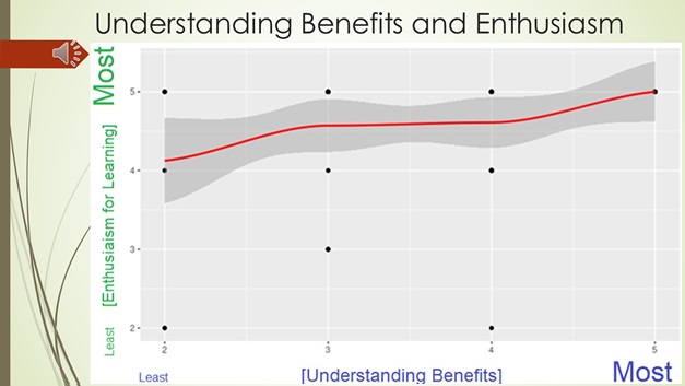
> cor.test(current_understand, want_understand) Pearson’s product-moment correlation data: current_understand and want_understandt = 2.5443, df = 66, p-value = 0.0133alternative hypothesis: true correlation is not equal to 095 percent confidence interval: 0.0650820 0.5015548sample estimates: cor 0.2988695
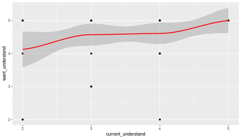
We get our correlation between those two variables. The correlation (which is under “cor” on the chart) is 0.298895. The closer this number to 1 the higher the correlation. That is a very low correlation between those two variables. We have a 95% confidence interval meaning we are 95% sure that the correlation is 0.298895. Here’s what the chart looks like.

When you look at this chart you can tell that the correlation is not very strong between column 7B (How well do you currently understand how your benefits work? 1 being very well and 5 being not at all) and column 8B (How well do you WANT to understand how your benefits work? 5 being very well and 1 being not at all?) . The more horizontal that the line is the less correlated they are. The more vertical the line is, the stronger the correlation is. However, there is some good news here. The chart shows that regardless of how much the members currently understand their benefits they generally want to learn about them. Enthusiasm for meetings will be high for our members.
Sharing Data Tough the Art of Visualization
Step 9: Share the Visualizations and Data with Stake Holders
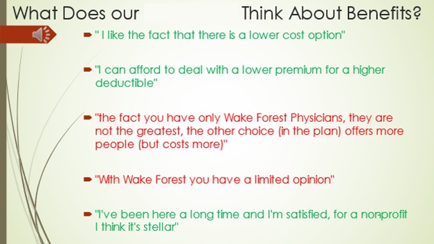
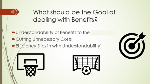
This is the follow up Presentation for the Data that I collected, Organized, Filtered and Analyzed to the stake holders.


Step 10: Review and Conclusion
I finished and submitted my presentation; I will look at the feedback that was given based on my presentation once the stakeholder reviews it. For this project I recorded audio and submitted this to the members above me at the organization, I didn’t go in front of them to present because they were too busy.
I will make changes based on their feedback for future projects and I will refer to this document when I work on my second Data Analysis project. I will have to do more in terms of working with the database and pivot tables. The data probably won’t be in First Normal Form and will need to be in Fourth Normal Form. This means I’ll have to make a Physical Model for the data too.
There will be more data to work with so cleaning the data will take longer than 3 or 4 hours (which is what it took on this project). If it is too large, I’ll need to use RStudio instead of Excel or Google Sheets.